One of the most important things in creating an effective and user-friendly digital product is understanding how users think. Whether it's a website, an app, or a complex software platform, the way information is organized can make the difference between a smooth user experience and a frustrating one.
But how can you get inside the minds of users? And how do you translate their thoughts into a coherent and intuitive structure?
This is where card sorting comes into the picture.
What is card sorting?
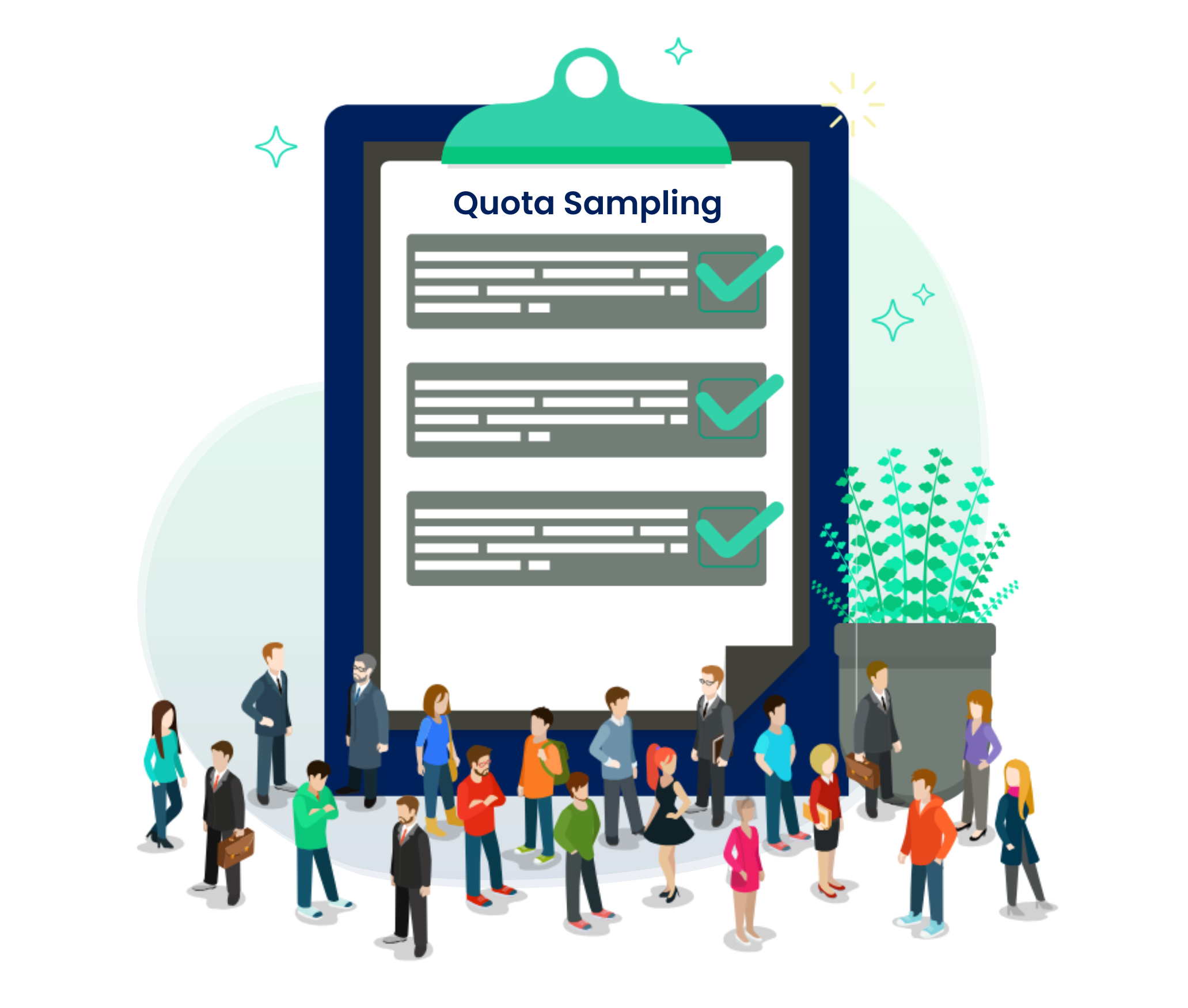
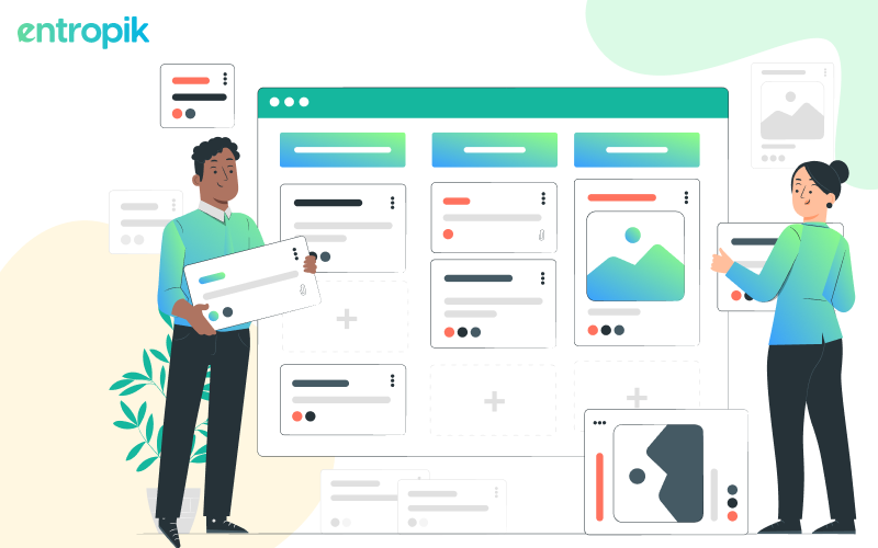
Card sorting is a research technique utilized in user experience design to gain insight into how users categorize and process information. It involves users organizing a set of cards, each representing a unique item or concept, into categories that make sense to them. This process enables designers to uncover users’ mental models and preferences in organizing information, thereby informing the structure and navigation design of a website or application.
This method can be conducted both in-person or remotely using specialized online tools, offering flexibility in gathering user insights. The data collected through card sorting is analyzed to identify common groupings and patterns, guiding the development of a website's menu structure and content organization.
When should you do card sorting?
Early exploration and research phase
During the initial stages of product development, card sorting can be instrumental. By understanding how users categorize information, designers can align the information architecture with users' expectations. It's a process that takes the guesswork out of the equation and replaces it with user-driven insights.
Concept validation
Before committing substantial resources to a project, card sorting can serve as a validation tool. It helps ensure that the proposed organization of content aligns with users' mental models. This preemptive step can save both time and resources in the long run.
Redesign and information restructuring
When revamping an existing product, navigation issues may arise. Card sorting can evaluate the current structure, identifying areas for improvement. It's a targeted way to fine-tune the experience, making it more intuitive for users.
Usability testing and iterating
Usability is at the heart of user experience, and card sorting can be a vital part of the iterative design process. By testing and refining the structure based on user feedback, designers can craft an experience that is not only functional but also user-friendly.
Competitive analysis
Understanding how your product compares to competitors is essential. Card sorting provides a lens through which you can analyze the information architecture of competing products. It offers a strategic advantage, allowing your product to stand out by optimizing user-centric design elements.
Accessibility and inclusivity
Lastly, a product's success depends on its ability to cater to a diverse user base. Including participants from various backgrounds in card sorting sessions ensures that the information architecture is inclusive. It demonstrates a commitment to providing a universally accessible experience.
Different types of card sorting
To understand the different types of card sorting, let’s take the help of a simple example. In this situation, here are our cards and categories:
Categories: Technology, Finance, Electronics
Cards: Apple, Google, Samsung, Paypal, Microsoft, Sony, Mastercard, Visa
Closed card sorting
In closed card sorting, users are given a set of cards and a list of pre-defined categories. They are then asked to sort the cards into the categories they think make the most sense. This type of card sorting is good for understanding how users understand and perceive pre-defined categories.
In our example, the user would be given the cards Apple, Google, Samsung, Paypal, Microsoft, Sony, Mastercard, and Visa, and the categories Technology, Finance, and Electronics. The user would then be asked to sort the cards into the categories they think make the most sense.
Open card sorting
In open card sorting, users are given a set of cards and no categories. They are then asked to create their own categories for the cards. This type of card sorting is good for understanding how users naturally organize information.
In our example, the user would be given the cards Apple, Google, Samsung, Paypal, Microsoft, Sony, Mastercard, and Visa. The user would then be asked to create their own categories for the cards. The user might create categories such as ‘Tech companies’, ‘Financial companies’, ‘Electronic companies’, or ‘Payment processors’, allowing you to understand how users naturally categorize the information naturally, without any external hints given.
Hybrid card sorting
Hybrid card sorting combines elements of both open and closed card sorting. n hybrid card sorting, users are given a set of cards and a list of pre-defined categories. They are then asked to sort the cards into the categories that they think make the most sense, and they are also allowed to create their own categories if they don't think the pre-defined categories are adequate.
In our example, the user would be given the cards Apple, Google, Samsung, Paypal, Microsoft, Sony, Mastercard, and Visa. In terms of the categories, they would be given the Technology, Finance, and Electronics categories, with the option to add more categories, if they feel the need to.
Reverse card sorting
Reverse card sorting (also known as tree testing) analyzed how findable information is in a given information architecture or website structure. Unlike traditional card sorting where participants categorize content items into predefined categories, reverse card sorting assesses users' ability to locate specific content within a hierarchical structure.
What are the advantages of card sorting?
User-centered information architecture
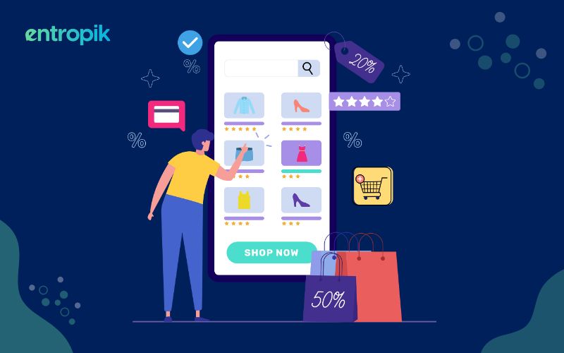
Card sorting uncovers how users naturally categorize information, allowing designers to create an information architecture that mirrors users' thought processes. For example, a well-executed card sorting exercise for an e-commerce site might reveal how users expect product categories to be organized, leading to a more intuitive navigation system.
Improved navigation and findability
Understanding how users group and label content enables designers to develop efficient navigation structures. This leads to a quicker, more streamlined process for users to find what they are looking for, potentially boosting user satisfaction and engagement rates.
Reduced cognitive load
A logically structured website or app minimizes users' cognitive effort, enhancing user experience. Users are more likely to continue using a product that provides clear pathways to the information they need without unnecessary complexity.
Validating information hierarchy
Card sorting verifies and fine-tunes the information hierarchy, assuring that crucial content is easily accessible. This not only boosts user engagement but can also enhance conversion rates by strategically positioning key call-to-action elements.
Data-driven design decisions
Card sorting produces tangible data on user preferences, empowering designers to make evidence-based decisions that reflect users' needs and wants. This data-driven approach contributes to a more effective, user-centered design.
Early detection of design flaws
Using card sorting early in the design phase can uncover potential flaws or areas of confusion, allowing for corrective actions before the development progresses too far. This proactive approach saves both time and resources.
Team collaboration
By involving various team members, card sorting promotes collaboration and consensus among designers, developers, and stakeholders. This alignment fosters a unified design direction and a cohesive end product.
Adaptable to different stages of design
The versatile nature of card sorting means it can be applied across different stages of design, from initial exploration to testing existing architecture. This adaptability makes it a valuable tool throughout the design lifecycle.
What are some of the challenges of card sorting?
Participant bias
Each participant comes with their set of experiences, beliefs, and backgrounds. For example, a user who primarily shops online might categorize "payment options" under "checkout" while another user familiar with brick-and-mortar retail might place it under "customer service". These inherent biases can influence how they perceive and sort content, and this subjectivity can affect the overall results.
Ambiguity
There are instances where content can logically fit into more than one category. For example, a card labeled "Contact" might be sorted into a "Customer Service" category by some participants, while others might place it under "About Us". Such ambiguities can lead to varied results, making it challenging to derive a clear consensus.
Influence of sorting method
The chosen card sorting method plays a crucial role in participant behavior. For instance, in a closed sorting exercise for a tech e-commerce site, if you provide categories like "Laptops", "Smartphones", and "Accessories", a participant might place "Mouse" under "Accessories". However, in an open sort, they might have created a separate category for "Peripherals".
Limited context
Without proper context, participants might sort cards differently than they would in a real-life scenario. If participants were to categorize a card labeled “Reservation” without context, they might think of it as related to restaurants. However, in the context of a travel website, they might associate it with booking a hotel room or a flight.
Cognitive load
If presented with an extensive set of cards, participants might find it overwhelming. Imagine sorting 100 cards related to a large-scale e-commerce site, ranging from product categories to customer service topics. The mental fatigue from this can lead to less thoughtful placements as the exercise progresses.
Analysis complexity
Post card sorting, designers are faced with a myriad of data points. If a website has a broad range of products, the sorting results could have numerous variations. Parsing through these to identify trends, especially when handling large participant groups, requires specialized tools and expertise to translate raw data into actionable design insights.
Changes over time
Just as fashion trends evolve, so do users' expectations and browsing habits. For instance, a decade ago, a card labeled "Streaming" might be categorized under "Entertainment". Today, with the proliferation of online streaming platforms, users might think of it as "Movies & TV Shows" or even specify platforms like "Netflix" or "Spotify". To keep up with these evolving mental models, regular reassessment of the site's information architecture is essential.
How should you conduct card sorting?
Define objectives
Clearly define the goals of the card sorting study. Determine what specific information or categories you want to test, and what insights you aim to gain from the participants' responses.
Select participants
Identify the target audience for your product or website and recruit participants who represent your user base. Aim for a diverse group that includes both new and experienced users.
Prepare cards
Create cards that represent the content or topics you want participants to sort. Each card should contain a single item, such as a page title, feature, or product category. Keep the number of cards manageable, ideally between 30 to 60 items.
Choose the card sorting method
Select the appropriate card sorting method based on your objectives. There are two common approaches:
Open Card Sorting: Participants create their own categories and label them as they see fit.
Closed Card Sorting: Participants sort cards into pre-defined categories provided by the researchers.
Explain the task
Introduce the card sorting task to the participants and explain the rules clearly. Emphasize that there are no right or wrong answers and encourage them to think aloud while sorting the cards.
Conduct the sorting sessions
Either in person or remotely, conduct the card sorting sessions with individual participants. If possible, observe and record their interactions and thought processes.
Analyze the data
After the card sorting sessions, analyze the collected data. Group the cards based on participants' choices to identify common patterns and themes. This will help you understand users' mental models and preferences.
Iterate and refine
Use the insights gained from card sorting to refine the information architecture of your product or website. If necessary, conduct additional rounds of card sorting to validate changes and iterate on the design.
Report and share findings
Summarize the results and insights from the card sorting study in a clear and concise report. Share the findings with your design and development team to inform decision-making.
Incorporate insights into design
Utilize the information architecture insights gained from card sorting to structure your product or website in a user-friendly and intuitive way. Continuously refer back to user preferences throughout the design process.


.png)


.jpg)


