
While times were slower and simpler before the internet, the digital space today continues to move and undergo massive transformations at a breakneck pace. With it, how you access information has evolved as well. There are multiple devices for use according to one’s convenience– from smartphones to desktops and everything in between. This poses a major challenge for brands: how do you ensure your website delivers an optimal experience regardless of screen size?
The answer to that question is a responsive web design. This approach to web design has become an industry standard. This guide will help you take a closer look at what a responsive web design means and the best ways to implement it for your website.
What is Responsive Web Design (RWD)?
Responsive web design, also known as responsive design or responsive website, is a method of web development that ensures that the functionality and layout of your website are optimized to fit any screen size. For example, a website that you view from a desktop can transform its content to fit a compact smartphone without affecting the readability and consistency of the user experience.
Websites were initially designed for fixed screen sizes, but the number of people accessing the internet on small screens has surpassed that. As per Semrush, compared to desktops, mobile saw 313% more visits in 2023.

With smaller screens, the challenge is that elements might overflow the viewport, requiring horizontal scrolling or pinching to zoom in. Responsive design eliminates these kinds of pain points by using flexible grids, fluid images, etc., to automatically adapt the website's layout based on the user's device.
Why is Responsive Web Design Important?
Below are some of the main reasons you should be having a responsive website design as a brand:
Enhanced User Experience (UX): A responsive website means a smooth and frustration-free experience for users on any device. This translates to fuss-free user experiences, leading to increased user engagement and satisfaction.
Improved Search Engine Optimization (SEO): No matter how high-performing your website is, search engines like Google prioritize the mobile version of it while indexing your website. This means having a responsive design ensures your website has an SEO advantage and ends up gaining better online visibility and search rankings.
Boosted Website Traffic: With the ever-increasing mobile user base, a big chunk of your target audience only uses mobiles for web browsing. A responsive website ensures this target group is included, and you don't miss out on potential website traffic simply because their screen size is different.
Reduced Costs: With responsive web design, maintaining separate websites for different devices is a thing of the past. You only need to manage one website, saving time and resources while maintaining uniformity across all users.
Increased Brand Credibility: Improve your brand reputation by showcasing your brand's commitment to user experience through responsive web design, which reflects professionalism in today's mobile-centric world.
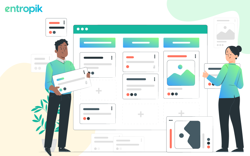
Building a Responsive Website: A Step-by-Step Guide
Building a responsive webdesign means brands need to take up a systematic approach that focuses on user experience and adaptability across various devices and screen sizes. Below is a step-by-step guide to help you build a responsive website that resonates with your audience:
1. Define Your Goals and Audience
Before diving into the technical aspects of website development, it's crucial to define your objectives and understand your target audience. Identify the primary purpose of your website and the key demographics you aim to engage with. This insight will inform your design decisions and help tailor the user experience to meet the needs of your audience.
2. Conduct Research
Gather insights into user behavior, preferences, and device usage patterns through market research, analytics, and user surveys. Understanding how your audience interacts with different devices will guide your responsive design strategy and layout decisions.
3. Plan Your Content Structure
Outline the content hierarchy and organization of your website. Consider how information will flow across various screen sizes and prioritize content based on its importance and relevance to users. A clear content structure ensures seamless navigation and readability on all devices.
4. Choose a Responsive Framework or Grid System
Select a responsive framework or grid system to streamline the development process and ensure consistent layout across devices. Popular frameworks like Bootstrap, Foundation, or CSS Grid offer pre-built components and responsive grid systems that simplify responsive design implementation.
5. Design for Mobile-First
Adopt a mobile-first approach to design, focusing on creating a seamless experience for mobile users before scaling up to larger screens. Start with the smallest viewport and prioritize essential content and functionality. This approach ensures that your website remains accessible and user-friendly on smartphones and other mobile devices.
{{cta-trial}}
6. Implement Fluid Layouts and Flexible Images
Design fluid layouts that adapt to different screen sizes using percentage-based widths and flexible units. Ensure that images scale proportionally to prevent distortion or cropping on smaller screens. Use responsive images with srcset and sizes attributes to serve appropriately sized images based on device capabilities and viewport size.
7. Use Media Queries for Breakpoints
Incorporate media queries to define breakpoints where your layout will adapt to different screen sizes. Experiment with breakpoints based on common device widths and test your website across various resolutions to ensure a seamless transition between layouts. Adjust typography, spacing, and navigation as needed to optimize the user experience at each breakpoint.
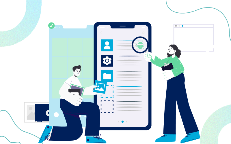
8. Test and Iterate
Regularly test your website on real devices and emulators to identify any responsiveness issues or usability concerns. Solicit feedback from users and stakeholders to gather insights for improvement. Iterate on your design based on feedback and performance metrics to continuously enhance the responsiveness and user experience of your website.
9. Optimize Performance
Optimize your website's performance by minifying code, compressing images, and reducing server response times. Implement lazy loading for images and content to prioritize critical resources and improve page load times, particularly on mobile devices with limited bandwidth. Monitor performance metrics and make adjustments to enhance the speed and responsiveness of your website.
10. Stay Updated and Evolve
Keep abreast of emerging web technologies and design trends to evolve your responsive website continuously. Regularly update your content and design elements to reflect changes in user expectations and device capabilities. By staying agile and responsive to evolving needs, you can ensure that your website remains user-centric and competitive in the ever-changing digital landscape.
Web Design Best Practices for Responsive Design
Now that you understand the importance of responsive design let's delve into the practical aspects of implementing it. Here are some key web design best practices to follow:
Fluid Grid System: A fluid grid system uses percentages instead of fixed pixels to define website layouts. This allows elements to resize proportionally based on the screen size.
Flexible Images: Images should also be defined using relative units like percentages or viewport width (vw) units. This ensures they scale appropriately and don't break the layout on smaller screens.
Media Queries: CSS is a rule-based language used in designing websites. Media queries are CSS statements that help you apply specific styles to a website based on the device's screen size, orientation, and resolution. Responsive design has the advantage of allowing you to define different styles for different screen sizes.
Responsive Navigation: Navigation menus on a desktop website are usually displayed horizontally across the top. However, due to the lack of space on a smaller screen, this can be changed to a hamburger menu for optimal use of space.
Content Hierarchy: Important content that needs to be prioritized should be displayed prominently on all screen sizes. Using a smaller device should not mean users should have to miss out on crucial information.

Responsive Web Design Examples
Numerous successful companies have implemented responsive web design the right way:
Apple: Apple, as a company, sets an example of excellence in design and strategy and it’s responsive web design is no exception. The clean and minimalist layout adapts seamlessly across all devices, providing a consistent and delightful user experience.
Google: Another big name that champions responsive design. Their website flawlessly adjusts to any screen size, ensuring users can easily find the information they need regardless of their device.
User Research for Responsive Web Design
User research platforms like Qatalyst, powered by new age technologies like Emotion AI, Behavior AI, and Generative AI, can be a valuable tool in optimizing your responsive webdesign. The platform can help you understand how users interact with your website on different devices, identify potential pain points, and refine your responsive design for maximum user satisfaction. Let us look at some of the studies that can be conducted on Qatalyst:
Usability Testing: Gain valuable insights into user behavior and emotional responses to your website on different devices.
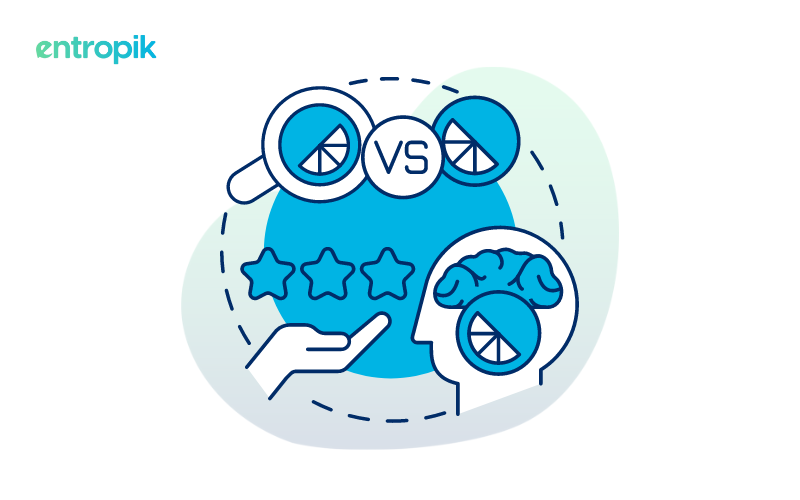
A/B Testing: Test and compare different responsive design website variations and identify the one with better performance for your target audience.
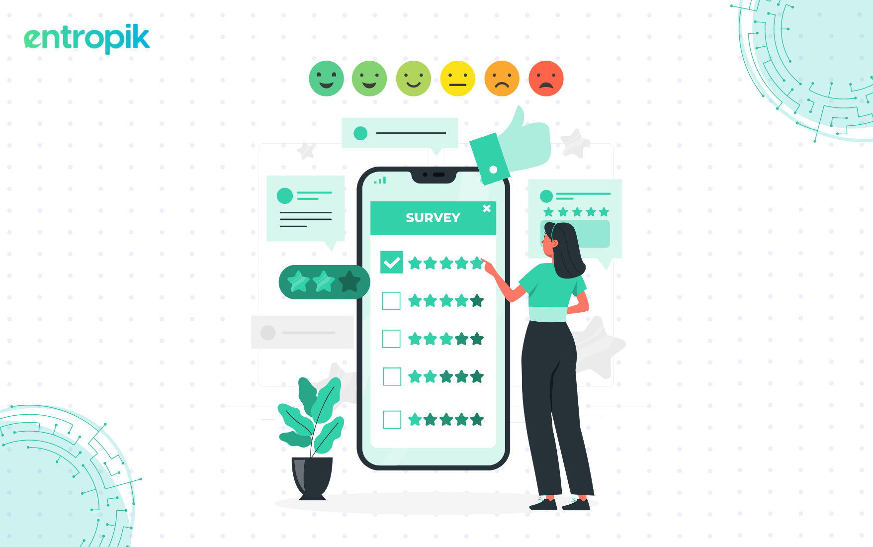
5-second Test: A time-bound test where users view a design and provide feedback based on immediate impressions and thoughts about the design.
The Future of Responsive Web Design
As technology continues to evolve and new devices emerge, responsive design will adapt to accommodate changes. Here are some exciting trends to keep an eye on:
Progressive Web Apps (PWAs): PWAs offer app-like functionality within a responsive website, providing a seamless user experience across devices.
Voice Search Optimization: With the rise of voice assistants, responsive design will need to consider how users interact with websites using voice commands.
Foldable Devices: The rise of foldable devices will require further innovation in responsive design to optimize website layouts for these unique screen formats.
Final Thoughts
Responsive web design is no longer a luxury or a trend but a necessity for brands wanting to make a mark in a highly competitive market. Approaches like responsive web design help brands in creating exceptional user experiences that encourages users to keep coming back for more. Take your website and apps to new heights and open up opportunities with advantages that comes with responsive design.
{{cta-trial}}


.jpg)


