
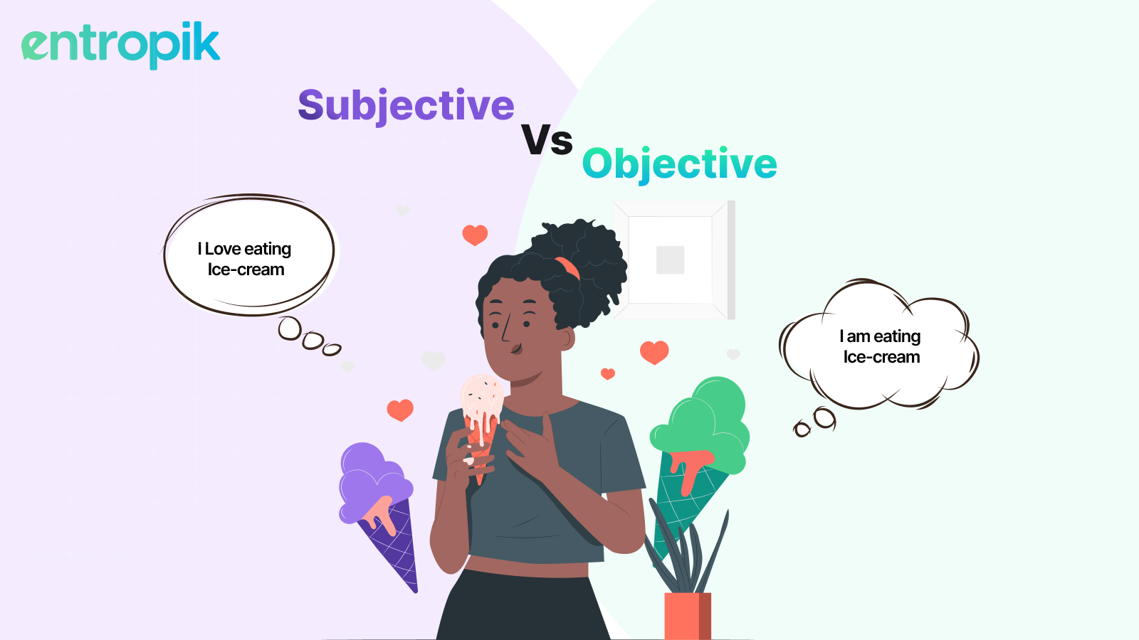
"Design is not just what it looks like and feels like. Design is how it works." – Steve Jobs
Ever noticed an user interface (UI) that feels almost tangible—like you could press a button and actually feel it move? That’s the magic of Neumorphism, a design trend that combines modern minimalism with subtle depth, giving interfaces a soft, almost futuristic feel.
If you’ve seen sleek, slightly raised buttons or text fields that seem to emerge from the background, you’ve already encountered neumorphism. It’s a style that mimics physicality without overwhelming realism, striking a delicate balance between skeuomorphism (real-world imitation) and flat design (minimalist simplicity).
But is neumorphism just another fleeting trend, or is it here to stay? And more importantly, how can UI designers leverage it to create functional yet visually engaging experiences? Let’s dive deep into the world of Neumorphism—what it is, how it impacts user experience and key principles to follow.
What is Neumorphism in UI Design?
Neumorphism, short for New Skeuomorphism, is a modern UI design trend that combines minimalism with subtle realism, creating a soft, almost 3D-like appearance. It gives UI elements a tactile quality, making them look like they are seamlessly emerging from or sinking into the background.
This design approach is a middle ground between skeuomorphism (which replicates real-world objects with intricate textures and shadows) and flat design (which focuses on simplicity and abstraction). Neumorphism retains the clean, minimalist aesthetic of flat design but adds depth and realism through soft shadows, highlights, and subtle gradients.
Principles of Neumorphic UI Design
To design a neumorphic UI that is both visually appealing and practical, keep these key principles in mind.
1. Balance Shadows & Highlights
Neumorphism is all about soft depth. Use two shadows—a light one (top-left) and a dark one (bottom-right)—to create a raised or pressed effect.
Example: A button should have subtle highlights on one side and shadows on the other to create depth without looking too harsh.
2. Maintain Readability & Contrast
Since neumorphism often lacks strong borders, ensure text and interactive elements remain legible.
- Use slightly darker or lighter shades for text.
- Add subtle outlines or glow effects when needed.
- Combine neumorphic elements with traditional UI cues for better clarity.
3. Use Color Gradients Thoughtfully
Avoid extreme gradients—neumorphism thrives on subtlety. Stick to soft, monochromatic color schemes with gentle variations.
Example: Instead of using bright blue and dark blue for buttons, use soft shades of the same blue with a subtle gradient for a refined look.
4. Ensure Interactive Elements Are Clear
Users should immediately recognize buttons, sliders, or input fields. A common mistake is making everything blend into the background.
- Use depth variations (stronger shadows for buttons, softer ones for inactive elements).
- Add hover effects or micro-interactions to guide users.
5. Blend Neumorphism with Other UI Styles
Neumorphism doesn’t have to be used in isolation. Combining it with flat design or material design can create a more usable and visually rich interface.
Example: A finance app could use neumorphic buttons for primary actions (like "Transfer" or "Deposit") but retain flat elements for navigation and secondary functions.
Key Features of Neumorphism
- Soft Shadows & Highlights
- Neumorphic UI elements use dual shadows: a light shadow (typically from a top-left light source) and a dark shadow (bottom-right).
- This creates a raised or sunken effect, making buttons, cards, and input fields look like they are molded from the background rather than sitting on top of it.
- Monochromatic or Low-Contrast Color Palettes
- Neumorphism relies on light variations of a single color rather than stark contrasts.
- It avoids hard borders and instead differentiates elements using depth and shading.
- Blended Elements
- Unlike material design, where buttons and cards feel like separate entities, neumorphic elements are part of the background and appear embossed or recessed.
- This seamless blending gives a sleek, futuristic look but can sometimes cause low accessibility issues.
- Minimalistic & Elegant Aesthetic
- Neumorphism removes unnecessary distractions, emphasizing clean, simple UI elements.
- It often pairs well with rounded corners, subtle animations, and soft color palettes for a modern and premium feel.
Example of Neumorphism in Action
Think of a modern smart home app with temperature controls. Instead of basic flat icons or hyper-realistic knobs, the UI has soft, raised buttons for increasing or decreasing temperature. These buttons subtly change when pressed, providing a visually satisfying and intuitive interaction.
How Neumorphism Differs from Other UI Styles
Neumorphism is a unique UI design approach that blends realism and minimalism, but how does it compare to other major UI styles? Understanding these differences helps in selecting the right approach for specific design needs.
Skeuomorphism vs. Neumorphism
Skeuomorphism was widely used in early UI design, particularly in Apple’s iOS interfaces before iOS 7, and in early desktop applications. This design style mimics real-world objects by incorporating textures, shadows, and highlights to create a lifelike appearance.
How Neumorphism Differs
- Neumorphism avoids extreme realism and removes unnecessary textures and intricate details
- Instead of sharp shadows and strong reflections, it relies on soft, blurred shadows to create a subtle 3D effect
- Unlike skeuomorphism, which imitates real-world materials, neumorphism maintains a clean and modern aesthetic
For example, in skeuomorphic design, a music player button might have a glossy, metallic appearance with reflections, whereas in neumorphism, the same button would appear softly raised from the background with smooth, diffused shadows.
Flat Design vs. Neumorphism
Flat design emerged as a response to skeuomorphism, eliminating unnecessary details, shadows, and gradients to create a clean and simplified interface. This style became widely adopted by companies such as Google, Microsoft, and Apple after iOS 7.
How Neumorphism Differs
- While flat design removes all depth, neumorphism introduces subtle depth through shadowing
- Flat design relies heavily on color contrasts to differentiate UI elements, whereas neumorphism uses soft highlights and shadows
- Flat design ensures strong readability, making it more accessible than neumorphism, which can sometimes suffer from low contrast
A typical button in flat design would be a simple, brightly colored rectangle with a clear label. In contrast, a neumorphic button would blend into the background with soft shading, making it appear slightly raised or recessed.

Choosing the Right UI Style
The best UI style depends on the specific goals of a design project.
Neumorphism is ideal for:
- Creating a modern, futuristic, and aesthetically appealing interface
- Applications that require a soft, tactile experience, such as smart home controls, financial dashboards, or music player interfaces
- Brands that emphasize elegance, simplicity, and innovation
How Neumorphism Affects UI and UX
Neumorphism primarily impacts UI design, enhancing visual appeal with soft, extruded elements. However, it can also affect UX, as low contrast and subtle shadows may reduce usability. To maintain both aesthetics and functionality, designers must balance neumorphic design with strong contrast, clear affordances, and accessibility principles.
Enhancements
- Modern and Visually Engaging – Neumorphism creates a sleek, futuristic look with soft shadows and depth, making interfaces aesthetically pleasing and unique.
- Minimalist and Focused Design – The clean, subtle gradients reduce visual clutter, enhancing focus and improving user immersion.
- Familiar Yet Fresh Interactions – By mimicking real-world elements in a subtle way, neumorphic design feels intuitive while maintaining a modern touch.
Limitations
- Poor Accessibility and Contrast Issues – Soft shadows and low contrast can make UI elements difficult to distinguish, especially for visually impaired users.
- Unclear Clickability – Buttons and interactive elements often blend into the background, making it hard to identify what is clickable.
- Performance and Dark Mode Challenges – Rendering shadows and highlights can be resource-intensive, and neumorphic designs don’t always translate well to dark mode.
Final Thoughts
Neumorphism offers a sleek, modern approach to UI design, blending the realism of skeuomorphism with the simplicity of flat design. While its soft shadows and seamless aesthetics create a visually engaging experience, careful execution is essential to maintain usability and accessibility.
Despite its appeal, neumorphism can present challenges such as low contrast, unclear interactive elements, and performance limitations. To make it practical for real-world applications, designers must optimize contrast, refine shadowing, and conduct thorough usability testing. When implemented thoughtfully, neumorphism can elevate user experience, making interfaces feel intuitive, immersive, and visually distinctive.


.jpg)


