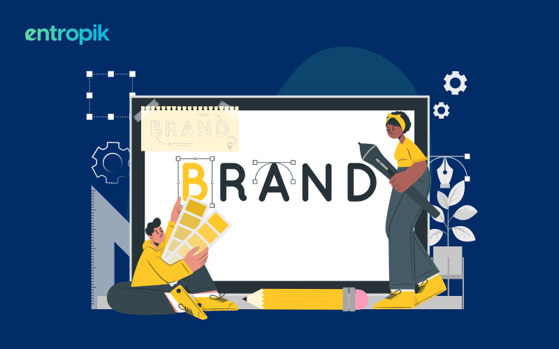
We all know and understand the importance of having a logo. While it is possible to create a logo with limited budget, we see brands investing a lot in creating simple, meaningful and well-designed logos that connect. Logos tell a story. They represent a brand and convey the essence of what the brand is all about. The shapes, colors and overall visuals of a logo comes together to create a story. This story builds a bond with the company’s consumers and stakeholders. Hence, it is imperative that a logo should not be misunderstood and be effective enough to represent the face and virtues of your brand.
Why is Logo Placement Important?
For successful branding, logos are meant to be seen by relevant users as much as possible. Once a logo design is completed, ensure it gets as much exposure and visibility as possible. For that, the right placement is very important. How you place your logo co-relates directly to how existing and potential users would view your brand. The best practices of logo placement suggests logos should be best placed on the left side. According to a research by Nielson Norman, since majority of human read from left to right, eyes are drawn naturally to the left first. Hence it follows that left placement usually draws user attention the most. However, rules are meant to be broken and a lot of times, brands might place their logos in other positions as well.
Important Factors in Logo Placement
Spacing around a logo: In addition to making it look neat and clean, practices like adding white spaces around a logo make a brand look more exclusive. A cluttered looking logo will give a perception of a cluttered brand and can harm your brand image.
Size of a logo: Based on usage on different channels, logos should be designed and sized differently. The correct size ensures users see it while understanding that it should not overwhelm the rest of the medium.
Fonts in a logo: For a branding to be consistent, fonts are easily one of the more underlooked factors. According to your design and purpose, using the right fonts to convey the right messaging in a logo can be a gamechanger.
Color combinations and placement: If you want users to connect with your brand from being exposed to your logo, understand color usage and how you can convey the right brand values through colors and color placements.
Versions of a logo: Many a times using the same logo design in different places can be monotonous and unsuitable. Within companies, different product lines might have different logos as well. It allows you the flexibility of products showing different characteristics from each other and grow as distinct brands individually as well.
{{cta-trial}}
Logo Usage in Different Medium
There are various tips and tricks for placing logo in different medium. Let us look at some of the most common ones in business:
- Websites: Logos on website serves three purposes according to Nielson Norman:
- Remind visitors about the brand and where they are.
- Allows easy navigation to the homepage through hyperlinking the logo.
- Aid in brand recognition and recall.
From the point of view of providing a good user experience, a left placed logo is found to be the most ideal for easy navigation and recall. The quality, legibility and white space around a logo plays an important part as well. Left placement makes it more noticeable since it is highlighted well without possible distractions on the page. Usability testing a website is one way to determine how a typical user journey is and if the logo placement is creating the desired impact.
- Emails: Regular emails and newsletter emails are couple of modern ways to increase engagements and improve customer experience. Ensure your email is visually attractive and the logo, along with the rest of your content looks clutter free. Having an organized layout consisting of your logo build credibility and makes you seem more professional.
- Documents: Any documents going out from an organization should include a layout which should be standardized to ensure professionalism. The top left corner is again the best location for logo placement. The logo here should be big enough to draw attention and at the same time, small enough to ensure the rest of the document does not get overpowered.
- Banners and Posters: Logo placements at eye level allows easy identification of brands when it comes to banners and posters. The left side remains the best place to catch user attentions and boost brand recall.
- Merchandise: Logo on merchandise depends a lot on the types of items you are going to use. Based on your customers or internal employees, merchandise are chosen differently. Find the best way to represent your logo based on shapes and sizes of the merchandise. If there are variations of a logo, use mockups to understand the most suitable ones for the relevant merchandise.
- Packaging: Packaging is also very dependent on shapes and sizes. There are several ways of placing a logo for packaging. A center placement works well for box packaging while a small, simple logo can be printed for smaller packages. It helps in making your product more exclusive as well. Pack testing is one research method to ensure you are designing a package which would have positive user interactions.
- Social Media: While building a brand on social media, consistency is key. Have consistent graphics, colours, texts, etc. Same goes for your logos as well. Templatize your layouts along with your logos and supporting content for maximum social media engagement and conversions.
Conclusion
There are also several testing methods to understand the right logo placements in the context of content type. A/B testing is one of the methods to compare between two or more logo designs to find the one which has the probability of performing the best once it is launched.
Remember- logos are the visible symbols of your brand. The same thing that build up a brand can be used to tear it down as well. So ensure you relate it to content which is distinctly yours and for which you can take responsibility for to build a connection with users. Think through the story you build around your logos and possible scenarios of how it can be perceived. Be careful of what your logo is associated with so that you can avoid negative associations to your brand by extension. By following the above tips and tricks, you can build a logo and a brand which everyone loves and help in fostering brand loyalty.
{{cta-trial}}


.png)


.jpg)


