Have you ever abandoned a shopping cart online? If so, you're not alone. Studies show that over 70% of online shoppers abandon their carts before completing their purchase. This can be a major frustration for businesses, and it can lead to lost revenue.
One of the main reasons why shoppers abandon their carts is because of a poor shopping cart UX. A well-designed shopping cart UX can help to reduce cart abandonment and increase conversion rates.
In this article, we'll discuss the key elements of a great shopping cart UX and provide tips on how to design a cart that will keep your customers coming back for more.
Read more: Exploring The Benefits Of Ecommerce UX
What are some of the elements of a shopping cart?
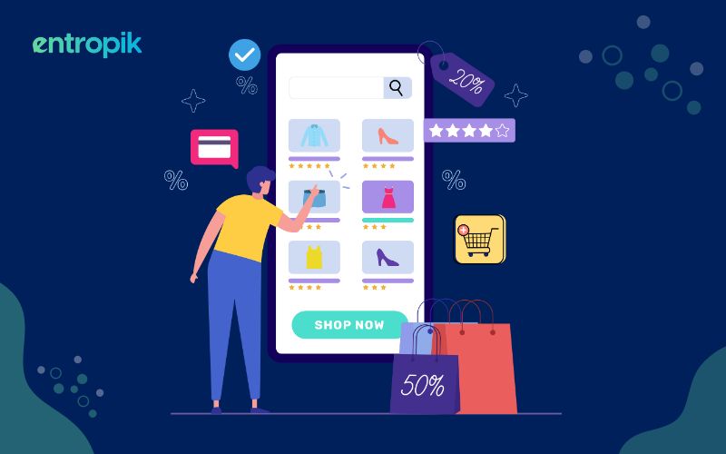
Here are some of the elements you will see commonly in a shopping cart:
- Product listings: A list of the products the customer has added to their cart, along with the product images, names, quantities, prices, and other product details like size or color.
- Product thumbnails: Small thumbnail images to help customers recognize the items in their cart.
- Quantity adjustment: To help customers to change the quantity of each item directly within the cart, typically by using plus and minus buttons.
- Price summary: A summary of the total cost, showing the subtotal (total cost of items before taxes and shipping), any taxes, shipping fees, and the final total cost.
- Coupon or promo code entry: Users may have the option to apply discount codes or promotional offers during checkout.
- Checkout buttons: Clear and prominent buttons that guide customers to the checkout process, such as "Proceed to Checkout," or "Continue to Payment."
- Save for later: A feature that allows users to move items they're not ready to purchase into a "Save for Later" or "Wishlist" section.
- Shipping information: A few fields to enter their shipping information, such as ZIP code, to calculate shipping costs.
- Security information: Trust badges and other security indicators to assure customers that their payment information is secure.
- Error messages: In case of errors or issues, guiding users on how to correct the problems, such as missing information or invalid promo codes.
- Guest checkout option: An option for customers to proceed to checkout without creating an account to speed up the process for first-time buyers.
Read more: 5 E-commerce UX Best Practices for Guaranteed Conversions
Tips to improve shopping cart ux
Clear and persistent cart visibility
Maintaining a clear and constantly visible shopping cart icon or summary is paramount. Place it prominently in the top-right corner of your website or app. When users add items to their cart, ensure that the cart icon visually updates. An effective technique is to provide a small cart preview that appears when users hover over the cart icon. This preview shows a snapshot of the current cart contents, giving users an instant overview of their selections, enhancing convenience, and reducing the need to navigate to the cart page.
Add-to-cart confirmation
After users add an item to their cart, reinforce this action with a subtle confirmation. This can take the form of a brief animation, a temporary pop-up, or a visual indicator on the cart icon itself. The purpose is to acknowledge the user's action without interrupting their shopping flow. For instance, the cart icon could briefly change color, flash to draw attention, or display a numerical badge showing the quantity of items in the cart. This confirmation reassures users that their selection was successfully added to the cart.
Detailed product information
Within the cart page, offer users access to comprehensive product information with a simple click or hover interaction. This should include vital details like product descriptions, available sizes, colors, and any other relevant specifications. The goal is to empower users to confirm their selections easily. For instance, a hover over a product image could trigger a pop-up displaying all pertinent information, avoiding user frustration and potential returns due to uncertainty.
Edit options
For each product within the cart, make it easy for users to adjust quantities, change sizes or colors, and even remove items directly from the cart view. Employ clear icons or labels alongside each product, indicating these edit options. When users make changes, provide immediate visual feedback, such as updated totals or real-time price adjustments. This hands-on cart management enhances user control and contributes to a seamless shopping experience.
Prominent call-to-action
Place a noticeable and distinctive "Checkout" or "Proceed to Checkout" button on the cart page. This button should visually stand out from other elements, often employing a contrasting color, a larger size, or a strategic location, such as at the top or bottom of the cart summary. This clear call to action guides users toward the next step in the purchasing process, reducing friction and encouraging conversions.
Visible shipping costs
Ensure that users have transparent access to shipping costs at an early stage in the shopping process. Better yet, offer a shipping cost estimator based on the user's location. By providing this critical information upfront, you empower users to make informed decisions and minimize surprises during checkout. This transparency is a crucial factor in decreasing cart abandonment rates.
Guest checkout
Acknowledge that not all users wish to create accounts or undergo lengthy registration processes. Therefore, prominently offer a "Guest Checkout" option on the cart page. Make sure this alternative is straightforward to find and access. While encouraging account creation is valuable for businesses, it's equally essential to cater to users who prioritize a quick and hassle-free purchase experience.
Saved carts
Implement a "Save for Later" or "Wishlist" feature that enables users to transfer items they're not yet ready to purchase into a saved list. This functionality not only curtails cart abandonment by preserving user selections but also keeps users engaged and invested in your platform. The ability to save items for future reference bolsters user satisfaction and loyalty.
Checkout progress indicator
Guide users through the checkout process by adopting a progress bar or step indicator. Clearly indicate the current step and provide a visual overview of the subsequent stages. This minimizes user anxiety, prevents feelings of being overwhelmed, and fosters a clear understanding of the checkout process. Users appreciate knowing where they stand in the journey and what to expect next.
Mobile optimization
Ensure that your shopping cart is well-optimized for mobile users. Responsive design is pivotal for adapting to diverse screen sizes and orientations. This entails mobile-friendly buttons, simplified forms, and streamlined navigation, all geared towards enhancing the mobile shopping experience. Test rigorously to ensure that the cart functions seamlessly on smaller screens.
Shipping options
Offer users a selection of various shipping options, encompassing choices like express, standard, or in-store pickup (if applicable). To enhance transparency and trust, furnish estimated delivery dates for each option, and provide tracking information for shipped orders. Users value the ability to choose a shipping method that aligns with their preferences, schedules, and budgets.
Cross-sell and upsell
Introduce the concept of cross-selling and upselling during the checkout process. This involves suggesting related or complementary products to what users have added to their cart. For example, if a user has selected a camera, the system could propose a compatible lens or a camera bag. This practice encourages increased order values and can lead to additional sales opportunities.
Saved shipping and payment information
Enable users to save shipping addresses and payment details for future transactions. This streamlines the checkout process for returning customers, as they can quickly select saved information. Providing this option simplifies and expedites future checkouts, thereby enhancing overall user satisfaction and retention.
Read more: 5 Last-Minute UX Tips to Get Your E-commerce Site Ready for the Holiday Season
Why is having a good shopping cart ux important?
Increased conversions
A well-designed shopping cart makes it easy for customers to add, review, and edit items. An intuitive and efficient cart reduces friction in the buying process, leading to higher conversion rates.
Reduced cart abandonment
A frustrating or confusing cart can lead to cart abandonment. When customers encounter difficulties during the checkout process, they are more likely to leave without making a purchase.
Improved customer satisfaction
A smooth shopping cart experience contributes to overall customer satisfaction. Happy customers are more likely to return, make repeat purchases, and recommend your site to others.
Enhanced trust
A transparent and reliable cart design, along with clear information about shipping, taxes, and returns, builds trust with customers. They feel confident that they know what they're getting into.
Error reduction
A good cart can help users catch errors or discrepancies in their order, such as incorrect quantities or invalid promo codes, before they reach the final checkout step.
Mobile-friendly experience
With the rise of mobile shopping, a responsive and mobile-friendly shopping cart UX is essential. It ensures that customers can easily navigate, add, and check out from their mobile devices.
Data collection
The cart can also be a valuable source of data on customer behavior. You can track which items are frequently abandoned or which steps in the checkout process cause issues, enabling you to make data-driven improvements.
Competitive advantage
Providing a superior shopping cart UX sets your e-commerce site apart from the competition. It's not just about selling products; it's about delivering an exceptional online shopping experience that keeps customers coming back.
To conclude
There are many elements that go into building a great website, but building a great shopping cart is one of the most important because it can make a direct impact on the number of conversions. By following these tips, you too can build a cart that encourages your users to complete their purchase journey.
{{cta-trial}}


.jpg)


