Overview
UX designers generally define a prototype as an early product version before it is launched, whereas fidelity refers to how close a prototype is to the final product. The fidelity of the prototype depends on the product life cycle. It can vary in content, design, and functionality of the product.
In this article, you will learn the differences between low-fidelity (lo-fi) and high-fidelity (hi-fi) prototypes, understand when to use and test which prototype.
What is low-fidelity?
Understanding low-fidelity prototype (lo-fi)
Low-fidelity prototypes are fast and easy to make. They represent a product concept without focusing on the visuals or interactive features. In layman's terms, it has minimum visual details and functionality, setting the stage for understanding and testing the concept/idea. They are quick and simple to make and test the prototype.
Types of low-fidelity prototypes
Typically, low-fidelity prototyping is done using paper or digital wireframes, depending on the nature of the product.
Paper sketches
They are fast and easy to create, making it easy to customize. It is useful when teams have less time to develop UX flows. With paper sketches either on a whiteboard or a paper, teams can understand flows and share ideas. The design elements of the products are not clickable, but paper sketch prototypes help teams design screen layouts and flows. This helps in reducing the time needed to develop initial digital wireframes.
Digital wireframes
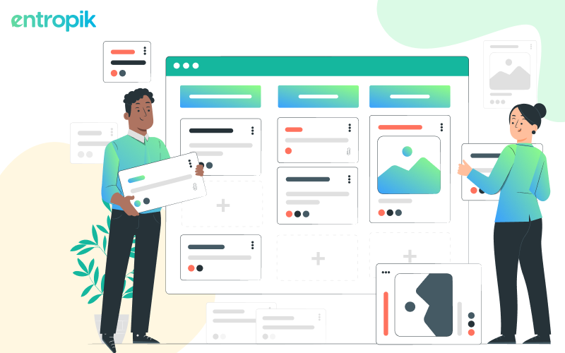
Digital wireframes are digital sketches that show only the functionality and content of the product but not the visuals. Digital wireframes allow you to change and customize layouts easily, depending on the need. The users will focus their feedback on functionality rather than being distracted by visuals such as colors and fonts.
Pros and cons of low-fidelity prototypes
Are you still figuring out when to use lo-fi prototypes? Do you have questions on how to use and test a lo-fi prototype? Here are some of the pros and cons every UX designer must look at -

Pros -
Better for evaluation
UX designers don't add colors and visuals to these prototypes so that the participants who give feedback while testing can better evaluate the product functions.
Inexpensive
Designers do not need to invest much money, making it easier to create and test drafts on paper sheets using prototype testing tools.
Quick & simple
The researcher is trying to test the product prototype and collect feedback only on the functionality, making it quick and simple to create the prototype.
Easy to collaborate
It is easy to collaborate with team members and understand the practicality of a lo-fi prototype as it does not require any significant interference from the designer.
Easy to customize
Lo-fi prototypes are easy to customize in the later stages of the product life cycle as they have a basic outline.
Cons -
Uncertainty
There’s a lot of uncertainty involved in the prototype as it has very little content and visuals. This makes it difficult for the tester to figure out the usability as the look and feel of the product is imaginary.
Low user interaction
The elements put out for testing are in the early stage, meaning the buttons and CTAs are not functional. This makes it difficult for the user/tester to interact with the product, compromising the user experience. The researcher might have to continuously prompt the user/tester that the prototype is less interactive.
When to use a low-fidelity prototype for testing?
- When you want to test your product’s capability
- When you want to test out your product’s idea
- When you have a budget constraint and are looking to justify before creating a hi-fi prototype
{{cta-trial}}
What is high-fidelity?
Understanding high-fidelity prototype (hi-fi)
A high-fidelity prototype is an upgraded version of a lo-fi prototype. It is a digital prototype that resembles the final version of a website or product. The researcher will want the designer to ensure that the content and design style of the high-fidelity prototype is 90% of the final version.
The visuals not available on lo-fi prototypes are now developed, giving the tester a complete picture of the final product. Designers use design elements and the final content, allowing the testers to interact. This would make it easy for the developers as it would be easy to understand UX before starting to develop the final version of the product.
Types of high-fidelity prototypes -
Mobile Applications
A mobile app prototype is the initial visual representation of your future app. It has a close resemblance to the final product and can be interacted with, even though it is not coded. The main purpose of this prototype is to visually tell a story of how the product’s concept will look and function.
UI Mockups
This type of prototype is created when a team presents a mockup of the end product with the actual design and appearance. This is useful for everyone attending the presentation to understand the product from various angles.
3D Printing
It’s a prototype created when the developers/designers want to present tangible products for their investors, who can see and touch the product. This prototype makes the product seem more real.
Pros and cons of high-fidelity prototypes
Here are some of the pros and cons every UX designer must look at -

Pros -
Detailed product functionality
A hi-fi prototype demonstrates detailed product/website functions, making it easier for the tester/user to understand how the final product will look, feel, and function.
Facilitate user testing
It allows potential users to interact with the prototype and contribute to the feedback process with a full understanding of the product.
Identify flaws early
High-quality prototypes make it easier to spot flaws in the product design, making it easier and quicker to highlight issues before the product launch.
Realistic user experience
Ensure that the product meets the possible user’s needs and expectations.
Test animated transitions
Test the motion visual transitions, micro animations, and more with hi-fi prototypes.
Cons -
Time-consuming and costly
Compared to lo-fi prototype designs, high-fidelity prototypes take longer to make. This eventually leads to investing a lot of money in creating the prototype
Difficult to make changes
Since the prototype is closer to the end product, it is difficult to make changes with multiple interconnected parts to the prototype.
When to use a high-fidelity prototype for testing?
- When you want to start development before you decide on the “final” design
- When you want to test how interactions, animations, and transitions affect the user experience
- When you want to demonstrate and communicate your product’s vision.
Bottom line
One of the common issues in product design is choosing the wrong fidelity type. Product designers make the mistake of creating high-fidelity detailed designs in the initial stages of the product. This could waste time and effort if the prototype doesn't provide value to the testers.
The UX team needs to have a clear understanding of the product life cycle, and low-fidelity prototypes can be a starting point. When the team understands the design direction and has tested it on prospects, they can raise the fidelity level. It's important for UX designers to understand that not every design aspect must be high fidelity.
{{cta-trial}}


.jpg)


