Out of the many ways a user is exposed to your brand, a website is one of the most common and crucial ways ones. Your landing page forms a major gateway for your brand to creating a first impression on users. It is one of the best ways to optimize your presence online and minimize lost opportunities. In this article, we will look at the importance of a landing page UX and actionable ways to enhance it.
Understanding Landing Page UX
Typically, landing page is a standalone web page created to increase conversions, majorly used in digital ad campaigns. Users might end up on this page through links from emails or social media ads. A good landing page has the capability to increase your CTRs or to convert a user to a lead.
While a website homepage is designed to provide a lot of information, its objective is not focused. What makes a landing page so crucial is it is designed to have a single-minded objective of increasing conversions by converting visitors into customers, subscribers or prospects.
Did you know that landing page conversion is 26%? This is true across all industries. This means there would be a decent amount of leads to nurture if you meet this benchmark by designed an effective landing page UX.
Impact of Landing Page UX
Improve first impression: A landing page gives an indication of the value your offerings can provide for companies. Leads and conversions aside, a well-designed landing page it can give your brand a good visibility thus warming up potential leads. The more effective your landing page is, the higher is your probability of conversions.
Reduce bounce rates: Providing a good impression through a landing page means users tend to stay on your page longer. Once users are more engaged, they would end up exploring your offerings further instead of dropping out.
Improve conversions: A good landing page usually make users take a pause because there is usually something in it for them. Be it increasing sign-ups or driving traffic, a user is more likely to go ahead if there is something of value to them like an ebook or webinar, which they can access. Connecting with your product leads users to click on your CTA button, thus increasing conversions.
Elements in an Effective Landing Page
Focused Messaging: Why your product or service stands out from the competition should be conveyed to users. An effective landing page ensures that your product positioning and messaging is appealing enough to make it stand out for a user.
Contextual Creative: Did you know about 79% users (according to Nielson Norman Group) tend to scan a page rather than read it? Since the average person responds to images better than they do to texts, a visual creative is one of the first thing they might notice on the landing page. Create images that is in line with your offering and which users can relate to. User testing can determine design elements which resonate with users and what might not be working.
Valuable Information/Offer: Landing pages often include a give and take situation with your users. The probability of engagement increases if users could see the benefits they stand to gain from being on the page. It could be a positive impact of using your product features or just an ebook they can download. Having something of interest for users can lead to better conversions.
Effective Call-to-Action (CTA): Focus on conversions with a well-designed CTA button or lead-gen form depending on your objective and design. Clicking on a CTA turns means a conversion. A generic or ineffective one can cause users to lose interest and drop out. A good way to determine an effective CTA is through A/B testing them beforehand to see which design creates better impact.
Social Proof: These are validations users might seek on your website to ensure your products/services are trusted by other users. They often influence users to make decisions in favor of your brand. A social proof can be client testimonials, case studies, logos, etc.
{{cta-trial}}
Best Practices For an Effective Landing Page UX
Keep it simple: The first impression of a landing page should be impactful with focus on the right and clear messaging. While you might want to share a lot of information, having a cluttered landing page would only lead to confusion leading to drop-outs. A simple, to-the-point messaging works best in this case.
Consistent messaging: The messaging in your landing page should be consistent throughout the user journey along their ideal defined path. Someone clicking on a link which leads them to the landing page should ideally have similar language and communication tone to maintain familiarity with users.
Limit Website Links: Any kind of navigation will be distracting and take away from the fact that users need to be focused on one objective. It will increase chances of users leaving a landing page without completing desired action. Hence ideally, any kind of links should be limited or removed altogether.
Visually appealing: Any kind of elements of a landing page as discussed above should have the key features which appeal to users. Elements should be places in a way that enables users to continue engaging.
Mobile Responsiveness: With a significant portion of internet traffic using mobile, users should have the flexibility of accessing a landing page from their phone. This ease of use would ensure you do not end up losing users who might have the potential of converting.
Enhancing Landing Page UX With User Research
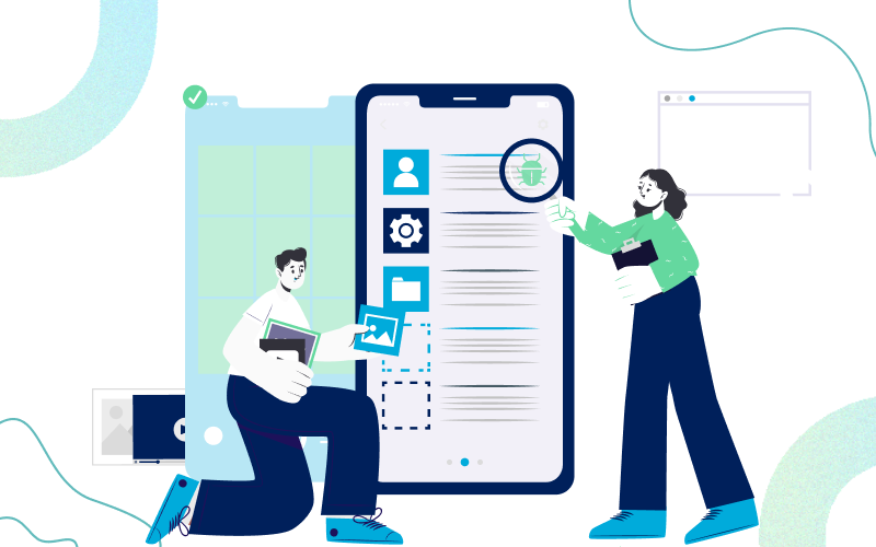
To ensure effective landing page UX designs, it is always a great idea to conduct user testing beforehand and optimize your designs. Entropik’s Qatalyst provides fast and reliable user research with options like A/B testing, Preference testing, 5-second test, etc. to give you insights on consumer preferences and design effective landing page UX. Let us look few of these common tests in detail.
A/B Testing: The process of creating a landing page can be confusing. Creating different design elements might make you unsure which version would perform better. A/B Testing is a research methodology where two or more versions of live designs can be tested to understand which one receives a better response from users.
The feedback from the test enables designers to take data-backed decisions and create a landing page where the probability of it resonating with users, and hence succeeding is higher.
Preference Testing: This is a user testing method to test multiple design elements and understand which one users prefer in the early, pre-live stage of a product creation. During this test, a participant is shown upto 5 or 6 different design options and asked to pick one.
Based on your objective and sample size, you can analyze qualitative and/or quantitative data from the feedback received. This will give you a clear understanding of design elements users connect with the most.
5-second Testing: This is a time-bound test method to understand if a design has the intended effect on users in the first few seconds of them viewing it. Paricipants are alloted a a time period (usually 5 seconds) to look at a new design. After that they are given a set of questions to answer. The results can give you clear insights on how effective your messaging is and recommendations on how to make it better.
Surveys: A well designed survey is a very simple way to collect data from a given set of population. This will let you understand more volume based user feedback which is effective and cost-efficient.
Ideally, user testing is an iterative process and any new landing page designs should be tested for it to be the most effective.
Conclusion
As one of the most common tools used by marketers today for lead-gen, landing pages help acquire and convert users. The UX should be designed in a way that reduces friction and minimizes drop-offs.
With proper strategy, landing pages should be at the forefront of your lead generation efforts. Studies have shown that brands with more landing pages tend to convert better than ones with lesser number. More conversions means more warm leads going down the sales funnel, eventual leading to increase in revenue.
{{cta-trial}}


.jpg)


