To easily understand taxonomy, imagine you have a box of toys. Now, think of putting all the similar toys together, like putting all the cars in one group and all the dolls in another. That's a bit like what a "taxonomy" does. It helps us sort, organize, and find them easily.
In the context of user research, to ask your friends what toys they like, we use a special kind of sorting called a "taxonomy" to ensure we understand what everyone is saying. It's like having labels for the different groups of toys so we know where everything belongs. This way, we can ensure everyone gets their favourite toys and has the most fun!
Imagine if you were given a box of 1000 un-categorized toys and asked to pick a red Ferrari toy car. Complicated, isn’t it? Well, it's like that with websites and apps, too! If it's easy to find things or if everything works super well, that's because of something called "good taxonomy decisions."
%2520(2).png)
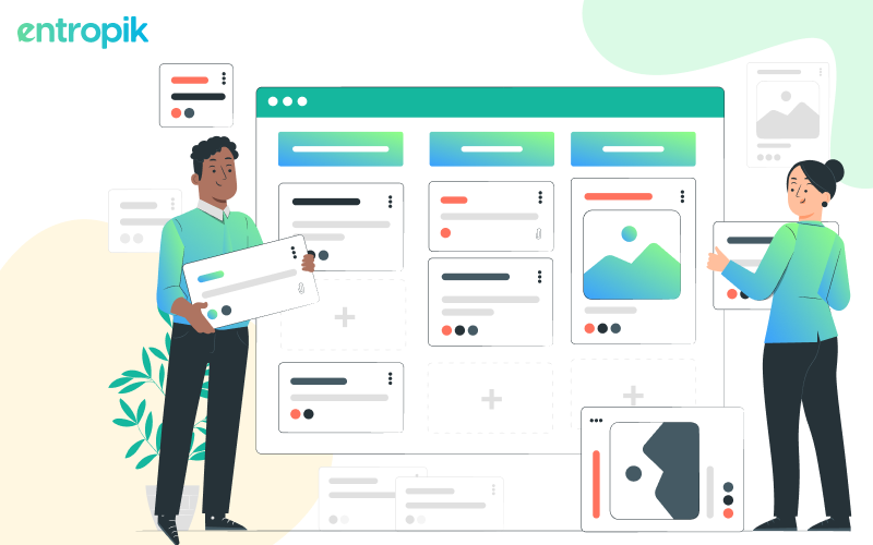
In this article, we'll learn how taxonomy helps ensure information is not confusing but clear and that navigating through websites and apps becomes easy instead of a puzzle that makes you scratch your head.
What is Taxonomy in User Research?
In science, the definition of Taxonomy is the scientific practice of giving names, describing, and sorting organisms. This covers everything from plants and animals to tiny microorganisms found worldwide.
UX designers want to design easily understandable websites and apps, so there's UX Taxonomy, sometimes referred to as taxonomies UX. This helps put information into groups or categories so that when the end user navigates through your website or app, it's easy to find what you're looking for. It's like making a treasure map so the user can quickly and easily discover all your product features without getting lost.
{{cta-trial}}
The Role of Taxonomies in Website and App Navigation
Do your users face difficulties to navigate easily on your website? If your website isn't set up for easy navigation, you might struggle with losing visitors and not doing well on search engines. Websites without a well-built taxonomy often confuse people, and they tend to leave quickly.
When people visit a website, they want to quickly understand what the page is about, find what brought them there, and know what to do next. According to Adobe, 38% of visitors will leave a website that doesn't make sense to them.
Taxonomy is an important tool for organizing information, not just about arranging information but also deciding on the words to use for everything. When you're setting up a system to help people find information easily on your apps and websites, the first step is to gather all the content you have and take a good look at it. After that, you need to think about other things like how content should be organized, who will use it, and what's normal for the people using it.
Types of Website Taxonomy (Taxonomy Classification)
When you're figuring out how to organize your website, there are different types of taxonomies, each with its own advantages and disadvantages. But the best one for your site depends on what kind of business you have and how people use your site. Your choices for sorting and naming on your site can be made using any of the below-mentioned taxonomies. Look at the below-listed example of taxonomy to have a better understanding.
Flat Taxonomy
A flat taxonomy is making a simple list of information on a website. It means you have categories, but they're all at the same level and equally important. It's like listing your favorite games - without ranking them.
For small websites, having a flat taxonomy is okay because it makes readability simple for visitors. But here's a tip: it's not a good idea to put everything on just one page. It's like telling a story – you want different pages for different parts.
Example of a flat taxonomy website: iStock organizes information and pictures in a simple way called flat taxonomy. On their website, all the categories are shown in a row at the top, and it's not too complicated.

Hierarchical Taxonomy
A hierarchical taxonomy is like a big plan for information on a website. It's often used by really big websites. At the top, there are general categories that cover a lot of content. When you go down, you get more specific about what you're looking for.
Imagine it's like a tree. The top is the trunk (big and general), and as you go down, you reach branches and then leaves (more detailed and specific).
This helps people quickly find what they need and move around easily on the website. Even search engines like Google find it easier to figure out what's where on the website because of this taxonomy structure.
Example of a hierarchical taxonomy website: Flipkart’s website is like a big store that sorts everything in a super organized way. They use hierarchical taxonomy, which is a bit like having a main point where everything starts. It's kind of like a treasure map with a big X marking the main spot.
So, when you're looking for stuff on Flipkart, they group information together based on what's similar. This way, when the user wants something specific, it's easy to find because everything has its own category.

Network Taxonomy
Network taxonomy is a way of organizing content on a website using both hierarchy and connections. It's like putting information in folders but also having links between the folders. Each item has a special place and a connection to other things that make sense to users. With network taxonomy, users can connect to the content meaningfully, making the website more user-friendly. If your site uses network taxonomy, it's important to ensure the networks are easy for users to navigate.
Example of a hierarchical taxonomy website: Amazon’s Prime Video sorts its shows and movies in a smart way called network taxonomy.
Even if something is placed in a particular category, it might still be similar to another category/genre. On Amazon’s Prime Video, there's a specific category called 'Top Movies' where you can find all sorts of movies mixed up together, like action movies and funny cartoons. It's a way to make all the top movies easy to find and watch.

Facet Taxonomy
Facet taxonomy is like a special way of organizing things on the website that's even more flexible. Instead of just putting something in one group, it can be in more than one group at the same time.
Facet taxonomy example: Makemytrip is a good example of facet taxonomy. You're searching for a place to stay, and you can use different filters, like the price range or the hotel type. On MMT, a hotel can fit into more than one filter. So, even if you use different filters, you might see the same hotel in the results because it matches what you're looking for in different ways.

Why is Taxonomy Important?
Sorting your website content in a smart way is helpful for the user to navigate. It not only makes it easy for people to use your site but is also beneficial for your SEO.
User experience (UX) design is all about figuring out what users want and making things easy for them. How information is shown and organized is super important when it comes to digital stuff, like websites and apps. That's where Taxonomy comes in—it's a key player in making things work well for everyone.
Here are 5 reasons why Website Taxonomy is super important in improving your user experience:
Better Search Results
Taxonomy is a super important tool for both people and search engines. When you organize your website content well, search engines can easily understand what's going on, and that makes your site show up more in searches. Just make sure to pick the right words that your audience is likely to use.
Consistency
Imagine your website is like a library. If you group similar books together and use the same labels, it's easier for people to find what they want. That's what a good taxonomy does for your website—it makes sure everything is organized and consistent.
Accessibility
Making your website easy for everyone to use is really important. A good taxonomy helps people with different needs navigate your site, making it smooth and simple for everyone.
Improves Retention
Making information organized doesn't just help people find what they want quickly—it also makes them remember and understand it better. When things are sorted out and labeled properly, users will want to come back to your website and learn more about your business.
Develops an Emotional Connect with the Users
When a website is easy to use, and things just flow smoothly, it makes people feel good. It's like when a brand or a website understands what you need, you tend to like them more. So, you end up sticking around and being more loyal to them.
How to Implement a Taxonomy?
Making a website organized and user-friendly is like setting up a neat and easy-to-use space. You're creating an easy-to-navigate website and want everyone, especially your visitors, to have a smooth experience. Here's a simple guide to building an information taxonomy, sometimes referred to as a taxonomy of information:
Know Your Goals
Start by figuring out what you want your information on the website to do. Do you want it to be easy for people to find stuff, look good in search results, or just be easy to manage?
Understand Your Audience
Think about who will visit your website and how they use it. Surveys, interviews, and tests can help you gather data about their preferences.
Analyze Existing Content
Look at what's already on your website. Are there things missing or not in the right place? Check if your categories make sense and if any pages need moving around.
Organize Your Stuff
Based on what you've learned, arrange your website in a way that makes sense. Pick a way to organize it based on the above-mentioned types of taxonomy.
Use Tags (like Labels)
Tags are like labels for your content. They help describe things and make it easier for people to find what they want. Use them, especially in blog posts or any other page.
Test It Out
After you've set everything up, test it. Check usability, analyze metrics, and gather feedback to ensure it works for users.
{{cta-trial}}
Keep It Flexible and Make Updates
Keep your structure flexible for new content. User needs change, so gather feedback and update based on what your visitors want.
Test Your Taxonomy with Qatalyst
Card Sorting
- To understand user’s categorization (pre-taxonomy)

Card sorting is a helpful method in user research that helps us figure out how people naturally group and organize information in their minds. By using card sorting, you can learn a lot about how users see connections between different ideas and how they prefer information to be arranged. These findings are crucial for website taxonomy design, apps, and other systems, making them more user-friendly and providing a better overall user experience.
{{cta-trial}}
Tree Testing
- To test the categorization (post-taxonomy)

Tree testing is done once you've sorted and labeled the information on your website to improve navigation. It's crucial to run tests and see how well the information taxonomy works. Tree tests, also called 'reverse card sorting,' are a popular and effective method for gaining valuable insights in this evaluation process.
{{cta-trial}}
Bottom line
When you assist your users in spending less time and effort finding what they need on your website, you're actually making their lives simpler and enhancing their overall experience.
If you want to enhance your users' experience, sign up with Qatalyst today! Utilize Card Sorting and Tree Testing to refine your information organization and make your website even more user-friendly!
{{cta-trial}}


.jpg)


