Imagine you're walking into a vast library, its shelves lined with books from floor to ceiling. The sheer volume of information can be overwhelming, making it difficult to know where to start. Now, imagine entering a library where the books are neatly organized into smaller sections, each labeled with a clear and concise title. Suddenly, the vast collection appears much more manageable.
Just like a well-organized library makes it easier to find the information you need, chunking in UX makes it easier for users to understand, remember, and act upon information. By breaking down complex information into smaller, more manageable chunks, UX designers can create a more user-friendly and effective experience.
What is chunking?
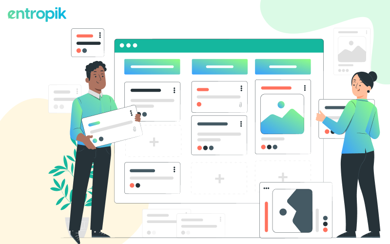
At its core, chunking is the art of breaking down large amounts of information into smaller, manageable units, or "chunks." Think of it as creating bite-sized pieces of content that the human brain can readily process. This concept aligns with the limitations of our working memory, allowing users to absorb information more efficiently.
To illustrate, consider a long paragraph of text. Trying to read it as a whole can be confusing and challenging. However, if we chunk it into smaller groups or paragraphs, it becomes far more manageable. The same principle applies to UX design.
What are the advantages and limitations of chunking?
Advantages:
Improved comprehension
Chunking enhances users' ability to understand and retain information. By presenting content in digestible portions, users can process and recall details more effectively.
Faster information processing
Breaking down information into chunks aligns with cognitive processing capabilities. Users can grasp the meaning quickly, leading to a more efficient user experience. For example, breaking down lengthy articles into well-defined sections allows readers to quickly scan and absorb key information.
Reduced cognitive load
Cognitive load refers to the mental effort required for information processing. Chunking minimizes cognitive load by presenting information in a way that aligns with users' mental capabilities.
Enhanced user engagement
Users are more likely to engage with content that is easy to understand. Chunking fosters a positive user experience, encouraging users to explore and interact with the interface.
Limitations:
Contextual relevance
In certain contexts, breaking information into smaller chunks might lead to a loss of context. Designers must ensure that the relationship between chunks remains clear to users.
Overuse concerns
While chunking is a valuable technique, overusing it may lead to an excessively fragmented interface. Striking the right balance is crucial to maintain a cohesive user experience. For example, overusing chunking in a navigation menu may lead to an overwhelming array of options, diluting the user's ability to navigate seamlessly.
{{cta-trial}}
How can chunking be applied in UX?
Content grouping
One of the fundamental applications of chunking in UX is content grouping. Consider a news website that presents articles in categories like "Politics," "Technology," and "Entertainment." By organizing content into thematic groups, users can easily navigate to topics of interest, reducing cognitive load and enhancing the overall user experience.
Progressive disclosure
Imagine encountering a lengthy form during an online registration process. Instead of bombarding users with an overwhelming array of fields, designers can employ progressive disclosure. This involves revealing information progressively across multiple steps or screens. Each step focuses on a specific set of information, preventing users from feeling inundated and making the interaction more user-friendly.
Visual hierarchy
Visual hierarchy is a potent tool that aligns seamlessly with chunking principles. By using size, color, or placement, designers can guide users through a page or interface. Think of a well-designed e-commerce website where product categories are highlighted in larger fonts or vibrant colors. This immediately draws the user's attention, making navigation intuitive and efficient.
Navigation menus
Clear and structured navigation menus are a testament to the power of chunking in UX. Consider a mobile app with a menu that neatly categorizes features under distinct headings. Each category acts as a chunk, simplifying the user's journey to find what they need. This not only enhances usability but also contributes to a positive overall impression.
Bullet points and lists
Incorporating bullet points and lists is a micro-level application of chunking, particularly effective for presenting information concisely. On a travel website, for instance, listing key features of a destination in bullet points ensures that users can quickly scan and absorb relevant details. This format minimizes cognitive load and allows for efficient decision-making.
Read more: The UX Design Process: How to Create Products and Services that Delight Your Users
What are the steps to do chunking?
Chunking is all about maintaining clarity in complexity. It’s not rocket science, but it's definitely an art. Here’s how you can do it:
Understand your audience
First and foremost, get to know your audience. Conduct user research to understand how your users process information. This knowledge is your foundation for effective chunking.
Identify key information
Every piece of content has its VIPs – the crucial information that steals the show. Whether it's the core features of a product, essential points in an article, or key steps in a process, identify these essentials before you dive into chunking.
Organize logic into groups
Imagine you're organizing a formal event – everything needs its designated place. Group your information logically, whether by topic, relevance, or sequence. Make it flow seamlessly, like a well-scripted plot.
Enhance with visual cues
Having visual elements in very important when you are conducting chunking. Incorporate clear headings, subheadings, bullet points, and whitespace strategically. Think of them as signposts guiding your audience through the different chunks of information.
Test and refine
Once your design is in place, it's time for a test run. Treat it like a soft launch for a select audience. Gather feedback on the user experience – how smoothly they navigate, comprehend the information, and move through the chunks. This phase is your chance to refine and optimize based on real-world insights.
How can UX research help with chunking?
Conducting UX research can serve as an invaluable tool to understand user preferences and refine your chunking process. Here’s how:
Card Sorting: This method helps you understand their mental models and preferences, guiding your chunking strategy.
User Interviews: Through user interviews, you can delve into your users’ preferences, learning how they process information and what kind of content organization resonates with them.
Usability Testing: Through usability testing, you can watch how users interact with your design in real-time. Analyze their journey through the chunks, identifying pain points and areas for improvement.
Read more: The Complete Guide to Conduct Usability Testing
Surveys and Questionnaires: Use structured questions to understand user preferences regarding information organization and chunking.
A/B Testing: A/B testing is your experimental approach, comparing different chunking strategies to see which one resonates better with users. It allows you to make data-driven decisions on the most effective information architecture.
Conclusion
By understanding and applying the principles of chunking, UX designers can break down complex information into manageable chunks, making it easier for users to process, remember, and act upon.
However, remember that chunking is not a one-size-fits-all solution. It requires a deep understanding of your users, thoughtful content organization, and a commitment to refining your approach based on real-world feedback.
{{cta-trial}}


.jpg)


