For UI/UX designers, effective communication of ideas is vital. Whether conveying creative visions to clients or presenting concepts to internal stakeholders, translating abstract ideas into tangible forms is crucial.
Moodboards serve a pivotal role in this process. They help organize thoughts, define a clear creative direction for projects, and ensure that designs evoke desired emotions in end users.
For those unfamiliar with moodboards, this guide provides comprehensive assistance. It covers everything about this valuable design tool, including step-by-step instructions for creating one's own.
What is a Moodboard?
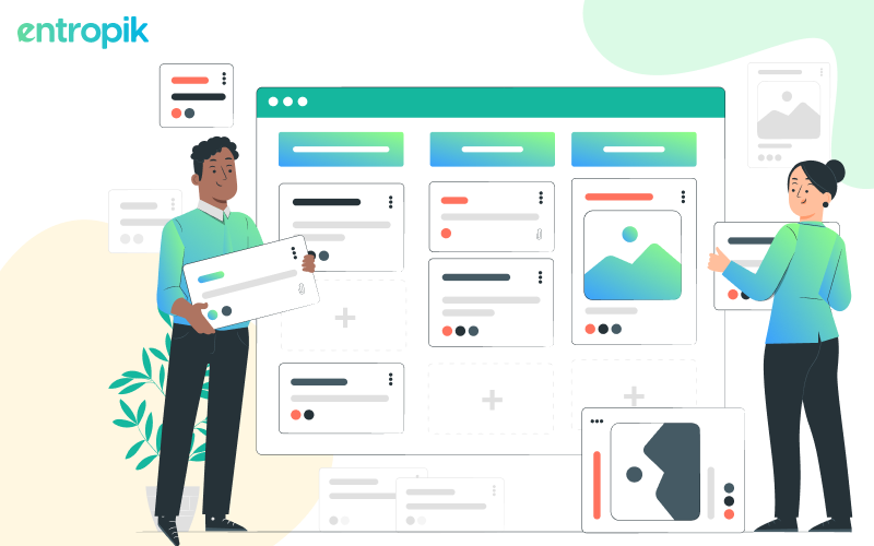
A moodboard is a visual collection of content used to convey an idea or concept.
A mood board establishes a particular atmosphere for various purposes. Whether for developing a new product, a marketing campaign, or a brand identity, a mood board communicates ideas through shared design elements.
Both teams and individuals utilize mood boards, also called inspiration boards, in their work processes. They serve as the initial step between conceptualizing an idea and creating the first draft of the work. Mood boards aid in organizing thoughts visually and inspire collaborative creativity.
During the early stages of the design process, mood boards save time by aligning team members and eliminating the need for lengthy discussions to articulate the desired aesthetic. Research indicates that mood boards enable designers to maintain creative freedom while staying coordinated and structured, resulting in mutual benefits.
Why Use Moodboards for UI/UX Design?

Mood boards serve the purpose of transforming disorganized or undefined ideas into a unified vision. They facilitate the transition from abstract concepts to tangible visuals, aiding in the sharing and communicating of ideas. Additionally, they function as effective tools for structuring design research and finding inspiration.
As a UI/UX designer, you may create a mood board to:
- Organize your thoughts and ideas, bringing clarity to your vision.
- Document research pertinent to a specific project.
- Share your creative vision with clients or key stakeholders to gather feedback and ensure alignment before moving on to wireframes and prototypes.
- Maintain a visual reference point throughout the design process, serving as a constant reminder of the desired outcome.
Mood boards are not exclusive to digital designers. They are versatile tools applicable to various projects, such as interior design, event planning, or personal goal visualization.
Regardless of the context, mood boards aim to present a distinct creative vision that illustrates the desired look and feel of the result.
Physical vs. Online Moodboards
Frequently, the question arises: should one opt for a physical or an online mood board? There is no definitive answer, as both have their merits and drawbacks. The choice between online and offline mood boards hinges on factors such as the nature of the project, available resources, and the board's intended purpose.
Physical Moodboards

Physical mood boards offer a tactile and impactful experience, engaging multiple senses like smell, touch, and taste. They are particularly effective for collaboration when individuals are physically present in the same space. Physical mood boards are well-suited for client presentations, small team meetings held in the same location, and designers seeking an immersive creative process.
However, physical mood boards are limited by their restriction to physical presence. Despite the effort invested in creating them, their utility is confined to those physically present. Attempts to convey their essence through photos or videos fell short, resulting in temporary solutions and missed opportunities for ongoing idea development as the project evolves.
Online Moodboards

While lacking the tactile dimension, online tools offer an extensive array of resources accessible with just a few clicks. This includes various styles, images, and inspirational pieces, which can more accurately evoke desired emotions than rely solely on personal creation skills.
An important advantage of online mood boards is their inherent shareability. Utilizing platforms like Canva, Pinterest, or Adobe Spark, online collaboration possibilities are virtually limitless.
Moreover, online mood boards offer the convenience of continuous accessibility. Unlike physical boards that may need to be cleared for other uses, digital boards can remain works in progress throughout the design process. In essence, a digital canvas never runs out of space.
What to Include in a Moodboard?
When crafting a mood board for a UX/UI design project, you have the flexibility to incorporate various digital assets that effectively communicate your vision. Common elements found in digital mood boards encompass:
- Photographs (including images of physical artifacts)
- Illustrations
- Stock images
- GIFs and animations
- Videos
- Sound clips
- Icons
- Typography
- Color palettes
- Textual content
In the subsequent section, we will guide you on where to seek inspiration for your mood board.
When to Create Moodboards?
Mood boards are employed in the initial stages of designing a new product or when making significant revisions to an existing one. They are commonly created during the Define or Ideate phases within the design-thinking cycle. By establishing a visual style consensus early on, mood boards help guide designers before they commence prototyping.
Team members can initiate mood boards, which are especially effective when crafted collaboratively. While typically led by creative professionals like user-interface designers, visual designers, platform designers, or motion (interaction) designers, they may also involve input from other stakeholders such as product owners, design leaders, or content managers. Generating multiple mood boards allows for experimentation with various moods, aiding in identifying the most suitable one for the product.
Additionally, mood boards can contribute to the persona-creation process by visualizing persona characteristics like hobbies, residence, occupation, favorite things, or beliefs.
Also read - 18 Best UX Design Tools in 2024
Step-By-Step Guide to Creating a Moodboard
This guide presents a fresh take on an old technique. Moodboards, which traditionally set the visual tone for UX projects through static PDFs, have evolved. Now, they can include dynamic elements like video and sound. They're easy to share online for feedback from clients and team members. Unlike before, these modern mood boards remain flexible and can change as the project progresses. Let’s detail each step to create an impactful mood board.
Step 1: Clarify Your Concept
The primary purpose of a mood board is to convey your creative concepts. To begin, it's essential to define your idea clearly.
For instance, if your company specializes in phone services for small businesses, start by compiling a list of relevant keywords related to your brand and industry. These could include small businesses, phone systems, budget phones, and remote sales communications.
Next, research these keywords for inspiration, such as illustrations, typography, and color schemes. This approach helps you focus on your concept and avoid distractions. By pursuing relevant leads, you increase your chances of uncovering ideas that align with your vision.
Step 2: Curate Your Mood Board
While a mood board visualizes your creative ideas, it's not a haphazard collection of images and text. Instead, it's a tool for effectively communicating your concepts.
Remember, your mood board is what your client will see to grasp your vision for the brand. Therefore, it needs to tell a cohesive story.
Take the necessary time to curate your mood board thoughtfully. Ensure that each element relates logically and seamlessly to the others. Your board shouldn't appear as a disjointed compilation of unrelated words and images.
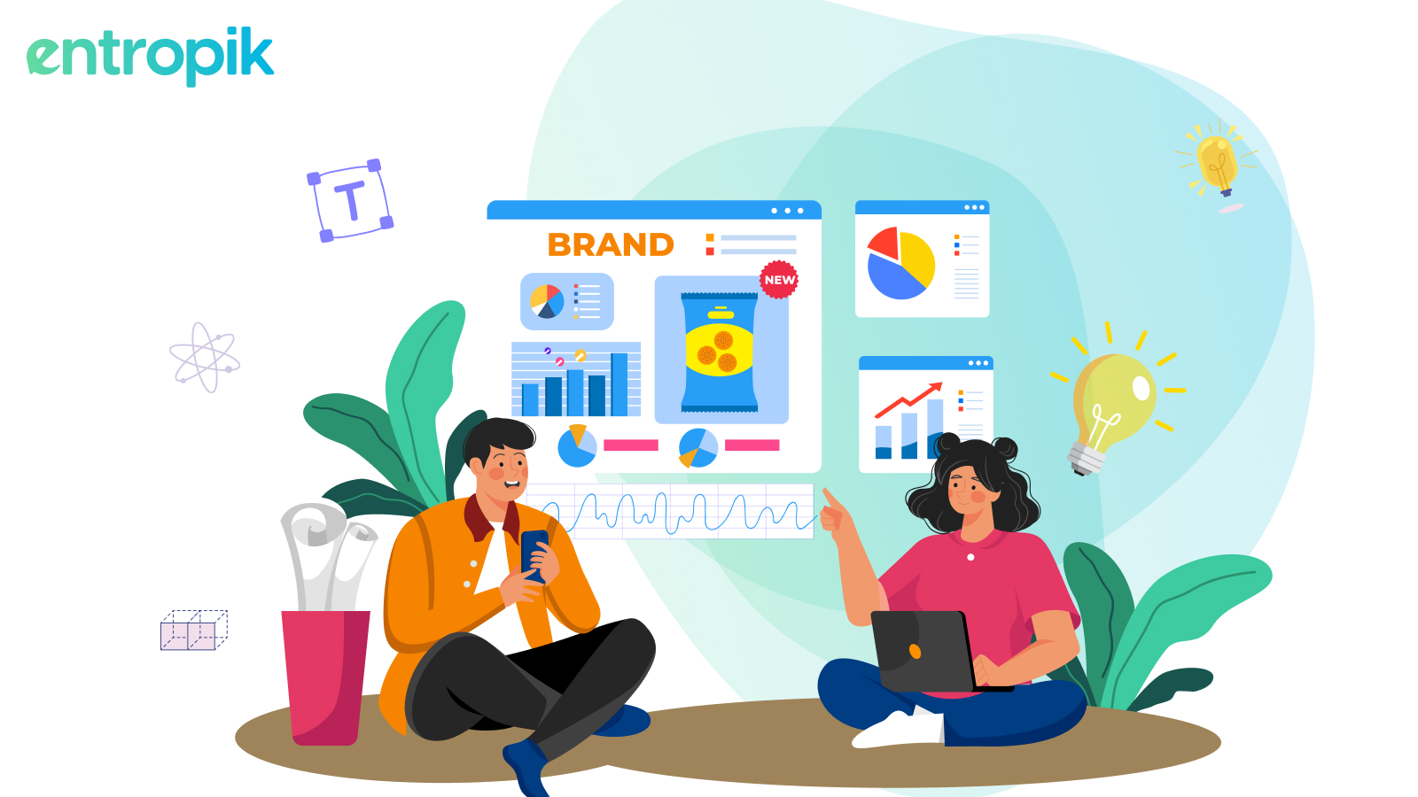
Example: Imagine you're a chief marketing officer tasked with launching a new line of organic snacks targeting health-conscious consumers. In your mood board presentation, you would include elements that highlight your product's unique selling points (USPs), such as its organic ingredients, eco-friendly packaging, and health benefits. You might feature vibrant images of fresh fruits and vegetables, visually appealing packaging designs, and graphics showcasing nutritional information.
However, you wouldn't include images of unrelated products or marketing materials from previous campaigns, as they wouldn't contribute to the cohesive story of your new snack line.
Each element selected for the mood board should be carefully chosen to support the overarching theme and message of the product launch, ensuring that all components align harmoniously to create a compelling visual narrative.
Step 3: Emphasize Your Primary Image
When crafting a mood board, it's beneficial to prioritize one key image and arrange other elements around it.
The key image should be larger than the rest, immediately capturing the audience's attention.
Example: Imagine you're a marketing manager tasked with promoting a new skincare product. Your key image for the mood board could be a captivating photograph showcasing the product prominently, accompanied by imagery evoking freshness, natural ingredients, and radiant skin.
Surrounding this key image, you would include additional visuals and text that reinforce the product's key selling points and brand identity. This might include images of botanical ingredients, testimonials from satisfied customers, and graphics highlighting the product's benefits, such as hydration, anti-aging properties, or sun protection.
By emphasizing the primary image and aligning supporting elements with the brand's messaging, you create a compelling mood board that effectively communicates the essence of the skincare product and entices potential customers to learn more and make a purchase.
Want to test before adding the image? - Deliver impactful media experiences by testing with Emotion AI and Behavior AI for unbiased insights
Step 4: Incorporate Authentic Photos
While stock photos are useful, incorporating real-life photos adds an authentic touch to your mood board.
You don’t need sophisticated equipment to capture these photos; your smartphone camera suffices. Whether it's captivating street art or the blooms in your garden, everyday scenes can inspire creative ideas.
Example: The hue of a rose in your garden might perfectly match the color you envision for your product packaging. Focus on capturing the essence rather than striving for perfection; the connection to your product matters most.
Real-life photos evoke genuine emotional responses, which is particularly advantageous when presenting to clients.
Step 5: Avoid Assumptions
When crafting a mood board, it's essential to approach it as if you're presenting it to individuals unfamiliar with your brand or product.
Avoid assuming that others understand the message you're trying to convey.
If necessary, include additional references to ensure clarity, but prioritize designing your mood board template to be easily comprehensible and largely self-explanatory.
Step 6: Validate Your Content and Messaging Before Launching
Conducting thorough testing is crucial before finalizing and launching your mood board’s content and messaging.
Leverage AI-powered UX research tools to gather insights through activities like A/B and preference testing. This ensures accuracy and helps in avoiding assumptions about audience preferences.
For instance, if you're developing mood boards for your consumer packaged goods (CPG) packaging, consider testing the creatives using a platform like Qatalyst. This allows you to gauge engagement levels among test users and identify areas of interest before proceeding with the final implementation.
{{cta-white}}
Bottom Line
In conclusion, mood boards are invaluable tools for UI/UX designers, enabling effective communication of creative concepts, organizing thoughts, and setting a clear visual direction for projects. Whether creating physical or online mood boards, the key lies in curating elements thoughtfully, prioritizing a primary image, incorporating authentic photos, and avoiding assumptions. Moreover, thorough testing of content and messaging using AI-powered tools ensures accuracy and enhances the effectiveness of mood boards in resonating with target audiences. By following these steps in the ultimate mood board guide, designers can create compelling visual narratives that captivate clients and stakeholders, ultimately leading to successful design outcomes.
{{cta-trial}}


.jpg)


